COMSAT SOLUTIONS
Maritime communications
Maritime communications
Rebranding (new logo and corporative identity) for a maritime communications company based in Liverpool, England.
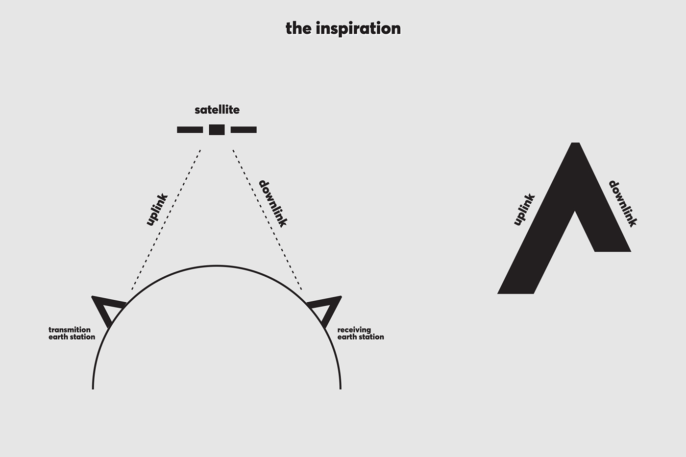
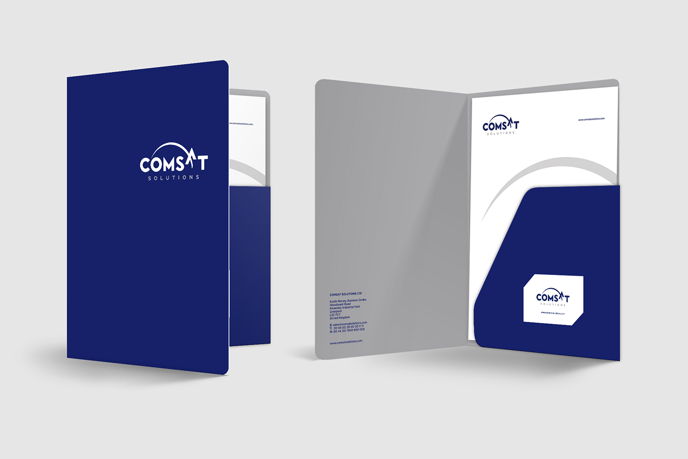
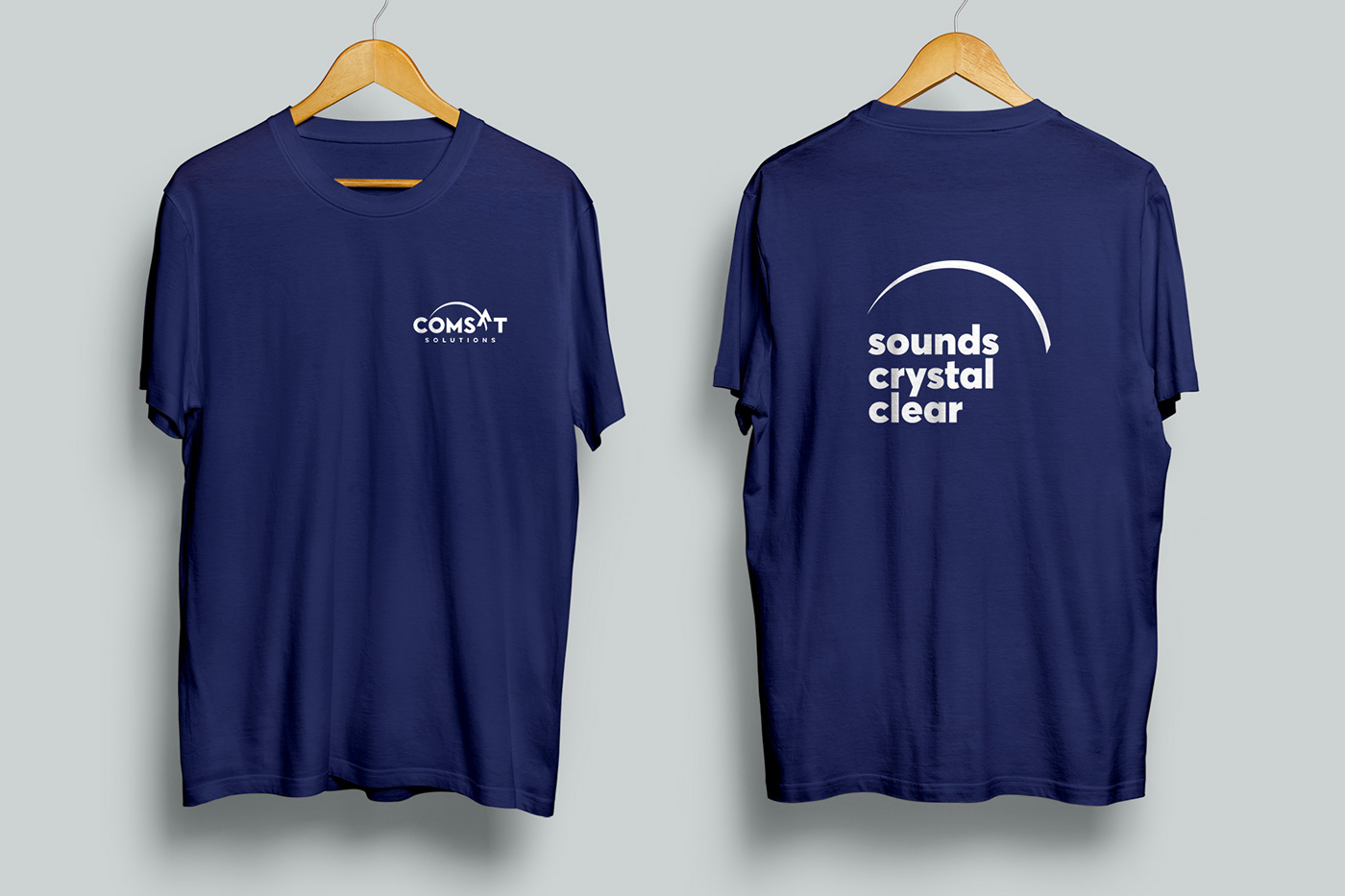
The kick-off brief of the project demanded something clean, simple and balanced on the axis ocean – space: the core sense of our cosmos. Having this in mind we created a minimal symbol which simultaneously represents the sun and the earth. Both and none, when absence becomes the evidence of presence. Under this strong symbolism we transformed letter ‘’A’’ into a satellite, in order to serve the up-link and down-link functions. The satellite is lifted up to reach outer space: ambitious and visionary. The dominant color is a British royal blue, expectable as well as undeniable. The blue of the skies and the blue of the seas. The sister color is a robust, elegant and precious silver.
The kick-off brief of the project demanded something clean, simple and balanced on the axis ocean – space: the core sense of our cosmos. Having this in mind we created a minimal symbol which simultaneously represents the sun and the earth. Both and none, when absence becomes the evidence of presence. Under this strong symbolism we transformed letter ‘’A’’ into a satellite, in order to serve the up-link and down-link functions. The satellite is lifted up to reach outer space: ambitious and visionary. The dominant color is a British royal blue, expectable as well as undeniable. The blue of the skies and the blue of the seas. The sister color is a robust, elegant and precious silver.
Graphic Design: Apostolos D. Tsiovaras
Account manager: Diamond Kritikakis